Introduction to CSS3: What is CSS3? CSS3 (Cascading Style Sheets Level 3) is the latest standard for styling web pages. It controls the visual presentation of HTML elements, including colors, layouts, animations, and interactions. Unlike HTML (which defines structure), CSS3 separates style from content—making code more maintainable and flexible.
Core Roles of CSS3
Style Enhancement : Customize fonts, colors, borders, and visual effects.Layout Control : Arrange elements, create responsive designs, and manage spacing.Interactive Animations : Add transitions, hover effects, and dynamic changes.
CSS Classification by Location
Inline Styles (Least Recommended)
1 <p style ="color: red; font-size: 14px;" > Text content</p >
Styles written inside HTML tags
Controls only the current tag
Used in special situations
Internal Styles (Useful for Single Pages)
1 2 3 4 5 <head > <style > div { font-size : 18px ; color : red; } </style > </head >
Written in section
Controls all elements on current page
Separates structure from style
External Styles (Most Recommended)
1 <link rel ="stylesheet" href ="./css/index.css" >
Separate CSS file
Controls entire website
Best for maintainability
CSS3 Selectors: Target Elements Precisely Selectors are patterns to target HTML elements for styling. They are the foundation of effective CSS3 usage.
Basic Selectors
Selector Type Syntax Matching Scope Reusability Example
Type Selector
tagname
All elements of the specified tag
High (for global styles)
div { color: pink; }
Class Selector
.classname
Elements with matching class attribute
High (reusable)
.btn { padding: 10px; }
ID Selector
#idname
Unique element with matching id
Low (one-time use)
#header { background: gray; }
Universal Selector
*
All elements on the page Global
*
{ margin: 0; padding: 0; box-sizing: border-box;}
Relationship Selectors Target elements based on their position relative to other elements:
Descendant Selector : A B (all descendants of A, including nested levels)1 ul li { list-style: none; }
Child Selector : A > B (only direct children of A)1 div > p { color: green; }
Adjacent Sibling Selector : A + B (immediately following sibling of A)+ p { font-weight: bold; } 1 2 3 4 5 6 7 8 9 10 11 12 13 14 15 ``` - **General Sibling Selector**: `A ~ B` (all siblings of A that come after) ```h2 ~ p { line-height: 1.5; }``` ### Pseudo-Classes & Pseudo-Elements<a name="pse"></a> - **Pseudo-Classes**: Target element states (e.g., hover, focus) ```css /* Link States (LVHA order) */ a:link { color: blue; } /* Unvisited */ a:visited { color: purple; } /* Visited */ a:hover { color: red; } /* Mouse over */ a:active { color: green; } /* Being clicked */ /* User Interaction */ div:hover { background: pink; } input:focus { border-color: blue; }
Structural Pseudo-Classes : Target elements by position1 2 3 4 5 6 7 8 9 10 li :first-child { color : pink; }li :last-child { color : green; }li :nth-child (3 ) { color : blue; }li :nth-child (odd) { background : #f0f0f0 ; } li :nth-child (even) { background : #fff ; } li :nth-child (3 n) { color : red; } li :nth-child (n+2 ) { margin-top : 10px ; }
Pseudo-Elements : Target specific parts of elements1 2 3 4 5 6 7 8 9 10 11 12 13 14 ::selection { background : pink; color : white; }p ::first-line { font-weight : bold; }p ::first-letter { font-size : 2em ; }input ::placeholder { color : #999 ; }div ::before { content : "Start: " ; color : red; }div ::after { content : " - End" ; color : blue; }
Attribute Selectors Target elements by attribute values:
1 2 3 4 5 6 input [type="text" ] { padding : 8px ; }[class*="icon" ] { font-size : 18px ; }a [href^="https" ] { color : green; }
Text Styling & Layout Control the appearance and arrangement of text with these core properties.
Font Styles
Property Description Common Values Example
color
Text color
Keyword, Hex, RGB/RGBA
color: #333;
font-family
Font type
System fonts, web fonts
font-family: “Microsoft YaHei”, sans-serif;
font-size
Text size
px, em, remfont-size: 16px;
font-weight
Text boldness
normal (400), bold (700)
font-weight: 600;
font-style
Text style
normal, italicfont-style: italic;
text-decoration
Text decoration
none, underline, line-throughtext-decoration: none; (remove link underlines)
Text Layout
Property ** Description**
Common Values Example
text-alignHorizontal alignment
left, center, right, justifytext-align: center;
text-indentFirst-line indent
em, pxtext-indent: 2em; (2 characters indent)
letter-spacingSpace between characters
px (positive/negative)letter-spacing: 1px;
line-heightLine spacing
px, multiplierline-height: 1.5; (1.5x font size)
Font Shorthand Combine multiple font properties into one declaration (order: style → weight → size/line-height → family):
1 2 3 body { font : normal 400 16px /1.5 "Helvetica Neue" , sans-serif; }
CSS Specificity (Priority)
Selector Type Specificity Example
!important
∞ (infinity)
color: red !important;
Inline Styles
(1,0,0,0)
<div style="color: red">
ID Selector
(0,1,0,0)
#header
Class/Attribute/Pseudo-class
(0,0,1,0)
.nav, [type="text"], :hover
Type Selector/Pseudo-element
(0,0,0,1)
div, ::before
Universal Selector
(0,0,0,0)
*
Specificity Calculation :#nav .item a = 0,1,0,0 + 0,0,1,0 + 0,0,0,1 = 0,1,1,1
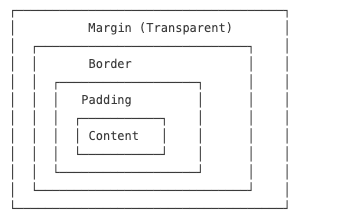
Box Model Box Model Components A box consists of four parts (from inside out):
Content : The actual content (text, images)Padding : Space between content and borderBorder : Line surrounding the paddingMargin : Space between the box and other elements
Key Properties Padding (Inner Spacing)
1 2 3 4 5 6 .box { padding : 10px 20px 10px 20px ; padding : 10px 20px ; padding : 10px ; }
Border
1 2 3 4 5 6 .box { border : 1px solid #ddd ; border-radius : 8px ; border-top : 2px dashed red; }
Margin (Outer Spacing)
1 2 3 4 5 .container { width : 1200px ; margin : 0 auto; }
Box Sizing By default, width/height only apply to the content. Use box-sizing to include padding and border:
1 2 3 4 * { box-sizing : border-box; }
Margin Collapse & Collapse Fix
Sibling Collapse : Vertical margins between block siblings merge (use only one margin)Parent-Child Collapse : Child margin affects parent, fix with:1 2 3 4 5 .parent ::after { content : '' ; display : block; clear : both; }
CSS Backgrounds Background Properties 1 2 3 4 5 6 7 8 9 10 11 12 13 14 15 16 17 18 19 20 21 22 23 24 div { background-color : #f0f0f0 ; background-image : url ('image.jpg' ); background-repeat : no-repeat; background-position : center center; background-size : cover; background-attachment : fixed; background : #f0f0f0 url ('image.jpg' ) no-repeat center center/cover fixed; }
Background Gradients 1 2 3 4 5 6 7 8 9 10 11 12 13 14 15 16 17 18 div { background : linear-gradient (to right, #ff6b6b , #4ecdc4 ); background : linear-gradient (90deg , #ff6b6b 30% , #4ecdc4 70% ); } div { background : radial-gradient (circle, #ff9a9e , #fad0c4 ); } h1 { background : linear-gradient (to right, pink, red); -webkit-background-clip : text; background-clip : text; -webkit-text -fill -color : transparent; color : transparent;
Box Shadows and Transitions Box Shadows 1 2 3 4 5 6 7 8 9 10 11 12 13 14 15 16 div { box-shadow : 2px 2px 10px 0 rgba (0 ,0 ,0 ,0.3 ); box-shadow : 2px 4px rgba (0 ,0 ,0 ,0.1 ), 0 8px 16px rgba (0 ,0 ,0 ,0.1 ); box-shadow : inset 0 0 10px rgba (0 ,0 ,0 ,0.5 ); box-shadow : 0 0 0 5px rgba (255 ,0 ,0 ,0.5 ); }
Transitions 1 2 3 4 5 6 7 8 9 10 11 12 13 14 15 16 17 18 19 20 21 22 div { transition : all 0.3s ease-in-out; transition : background-color 0.3s ease, transform 0.5s cubic-bezier (0.4 , 0 , 0.2 , 1 ), opacity 0.2s linear 0.1s ; transition-property : width, height; transition-duration : 0.3s , 0.5s ; transition-timing-function : ease-in, linear; transition-delay : 0.1s ; div :hover { background-color : pink; transform : scale (1.05 ); } }
Text Styling Font Properties 1 2 3 4 5 6 7 8 9 10 11 12 13 14 15 16 17 18 19 20 21 22 23 24 25 26 27 28 29 30 31 32 33 34 35 p { color : #333 ; color : rgb (51 , 51 , 51 ); color : rgba (51 , 51 , 51 , 0.8 ); font-family : "Helvetica Neue" , Helvetica, Arial, sans-serif; font-size : 16px ; font-size : 1rem ; font-size : 1.2em ; font-style : normal; font-style : italic; font-style : oblique; font-weight : 400 ; font-weight : 700 ; font-weight : normal; font-weight : bold; text-decoration : none; text-decoration : underline; text-decoration : line-through; text-decoration : overline; font : italic 700 16px /1.5 "Helvetica Neue" , sans-serif; }
Text Layout 1 2 3 4 5 6 7 8 9 10 11 12 13 14 15 16 17 18 19 20 21 22 23 24 p { text-align : left; text-align : right; text-align : center; text-align : justify; text-indent : 2em ; letter-spacing : 1px ; letter-spacing : -0.5px ; line-height : 1.5 ; line-height : 24px ; text-transform : none; text-transform : uppercase; text-transform : lowercase; text-transform : capitalize; }
Text Overflow Usually we write it in common.css and then consume it like class="single-line"
1 2 3 4 5 6 7 8 9 10 11 12 13 14 15 .single-line { white-space : nowrap; overflow : hidden; text-overflow : ellipsis; } .multi-line { display : -webkit-box; -webkit-box-orient : vertical; -webkit-line -clamp: 3 ; overflow : hidden; text-overflow : ellipsis; }
CSS Sprites CSS Sprites combine multiple small images into one large image to reduce HTTP requests.
Implementation
1 2 3 4 5 6 7 8 9 10 11 12 13 14 15 16 17 18 19 20 21 22 23 .icon { background-image : url ('sprite.png' ); background-repeat : no-repeat; display : inline-block; } .icon-home { width : 32px ; height : 32px ; background-position : 0 0 ; } .icon-search { width : 32px ; height : 32px ; background-position : -32px 0 ; } .icon-user { width : 32px ; height : 32px ; background-position : -64px 0 ; }
Font Icons Font icons use icon fonts instead of images for scalable, styleable icons.
Using Icon Fonts 1 2 3 4 5 6 7 8 9 10 <link rel ="stylesheet" href ="font-awesome.css" > <i class ="fa fa-home" > </i > <i class ="fa fa-search" > </i > <i class ="fa fa-user" > </i > <i class ="fa fa-star" style ="color: gold; font-size: 24px;" > </i >
Popular Icon Libraries
Font Awesome : Comprehensive icon setBootstrap Icons : Simple and cleanIonicons : Modern iconsMaterial Icons : Google’s design systemIconFont (Alibaba) : Chinese market favorite
CSS Best Practices Reset/Normalize CSS 1 2 3 4 5 6 7 8 9 10 11 12 13 14 15 16 17 18 * { margin : 0 ; padding : 0 ; box-sizing : border-box; } ul , ol { list-style : none; } a { text-decoration : none; color : inherit; } <link rel="stylesheet" href="https://cdn.jsdelivr.net/npm/normalize.css">
CSS Organization 1 2 3 4 5 6 7 8 9 10 11 12 13 14 15 16 17 18 19 20 21 22 23 24 25 26 position : absolute;top : 0 ;right : 0 ;z-index : 10 ;display : block;width : 100% ;padding : 20px ;margin : 0 auto;font-family : sans-serif;font-size : 16px ;line-height : 1.5 ;color : #333 ;background-color : #fff ;border : 1px solid #ddd ;border-radius : 4px ;transition : all 0.3s ease;
Responsive Considerations 1 2 3 4 5 6 7 8 9 10 11 12 13 14 15 16 17 18 19 20 21 22 23 .container { width : 90% ; max-width : 1200px ; margin : 0 auto; } body { font-size : 16px ; } @media (min-width : 768px ) { body { font-size : 18px ; } } img { max-width : 100% ; height : auto; }
Example 1: Product Card (Xiaomi Style) 1 2 3 4 5 6 7 8 9 10 11 12 13 14 15 16 17 18 19 20 21 22 23 24 25 26 27 .product-card { width : 300px ; padding : 16px ; border-radius : 8px ; box-shadow : 0 2px 8px rgba (0 ,0 ,0 ,0.08 ); transition : all 0.3s ease; } .product-card :hover { box-shadow : 0 8px 24px rgba (0 ,0 ,0 ,0.12 ); } .product-card img { width : 100% ; height : 200px ; object-fit : cover; border-radius : 4px ; } .product-title { font-size : 16px ; margin : 8px 0 ; white-space : nowrap; overflow : hidden; text-overflow : ellipsis; } .price { color : #ff6700 ; font-weight : bold; }
Reset Default Styles : Use * { margin: 0; padding: 0; box-sizing: border-box; } or Normalize.css for cross-browser consistency.Reuse Classes : Prefer class selectors over IDs for reusability.Mobile-First : Design for mobile first, then use media queries for larger screens.Avoid !important : Overuse breaks specificity—use only for emergencies.Optimize Performance : Use icon fonts/sprites instead of multiple images; minimize selectors complexity.